RSS

Blog posts tagged with 'Configuration'

Theme X Responsive Configuration Guide

Last Update 2015-06-21

Capabilities

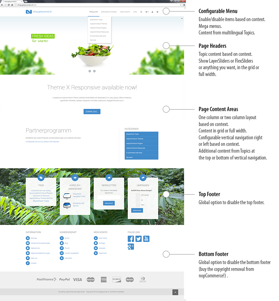
This theme has some unique configuration capabilities. For example, you can create a site with just login, blog, forum and multilingual functionality (shop functionality disabled). Some configuration can be dynamic based on a context. The context is defined by the Page ID.


Theme X Responsive Capabilities


Install your Logo

Create your logo image in the size 230x80 pixels and name it logo.png. Upload it to Content/Images/uploaded/logo.png. Or configure the path and file name (see the 'Configuration Object Description') and upload it there.

A sample logo image:


Set up your Home Page

In Content Management > Topics (Pages) open the topic HomePageText and replace the code in the source code editor with this (of course make a copy of your current code first):


Set up a LayerSlider or FlexSlider on Home Page

In Content Management > Topics (Pages) add a topic with the name _Header_Home_Index_1 and add this code in the source code editor for a LayerSlider:

Find more information at KREATURA MEDIA what you can do with LayerSlider. Or contact us, we will create your fancy slider :)

Add this code for a FlexSlider:


Change the Top Footer Background Image

Create a image with the size 1600x900 pixels, name it footer-top-background.jpg and upload it to /Themes/X20/Content/theme/images/.


Image Settings

In Administration - Settings - Media Settings set the image sizes to these values:
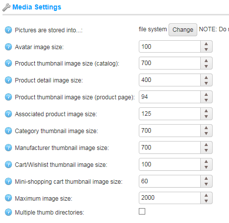
Media Settings


Theme Configuration Object

The theme can be configured through the topic with the system name _Configuration you have to create in Content Management > Topics (Pages). With the text in this topic in the form of a JSON object, you can configure the menu, the page layouts and some more stuff. For more information see the 'Configuration Object Description'. For JSON editing, check out this nice Online JSON Formatter... and this useful Online JSON Editor...

A sample configuration object:


Page ID's


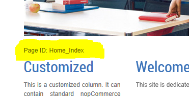
If you are logged in with administrative rights, you will find different Page ID's for different pages/sections of your website (generated from Controller/Action) at the bottom left corner of your browser. These Page ID's can be used as a context reference for several configuration options.


About Header Configuration

Headers are created through topics with a specific system name. Topics can be created in the administration area Content Management > Topics (Pages). To create a header that shows on all pages, create a topic with the system name _Header_1 . You can create up to 4 headers if you create also topics with the system names _Header_2, _Header_3 and _Header_4. To create headers for a specific context, first read the Page ID when logged in as administrator. Then create a topic with the following system name: _Header_Page ID_1 . For example, the system name for a topic for the home page would be _Header_Home_Index_1 . And optional, create _Header_Home_Index_2 , _Header_Home_Index_3 , _Header_Home_Index_4.


About Vertical Navigation Content Configuration

As with headers (read above), you can create content at the top and at the bottom of the vertical navigation area. Just replace the string _Header with RightColumnBefore and RightColumnAfter and use the same principals as with headers.


Configuration Object Description

Definition as C# classes:

public class Configuration
{
    public List<MenuItem> menu;
    public List<VerticalMenu> verticalmenu;
    public bool nosearch;
    public bool noverticalmenu;
    public bool noverticaldefaultmenu;
    public bool hideproductselectors;
    public int columnsdefault;
    public bool nogriddefault;
    public bool leftnavdefault;
    public bool disablefootertop;
    public bool disablefooterbottom;
    public string logo;
    public List<string> columns1;
    public List<string> columns2;
    public List<string> nogrid;
    public List<string> leftnav;
}
public class MenuItem
{
    public List<string> context;
    public List<string> contextexclude;
    public string title;
    public string url;
    public bool megamenu;
    public bool rightalign;
    public bool active;
    public List<MenuItem> submenu;
    public string target;
    public string cssclass;
}
public class VerticalMenu
{
    public List<string> context;
    public List<string> contextexclude;
    public string title;
    public string titleurl;
    public bool after;
    public bool onsystemmenu;
    public List<MenuItem> menu;
}


Object 'Configuration' (JSON root object)

NameTypeDescription
menu Array of objects MenuItem List of menu items in top navigation.
verticalmenu Array of objects VerticalMenu List of vertical menu blocks.
nosearch bool Disable serach.
noverticalmenu bool Disable entire vertical menus.
noverticaldefaultmenu bool Disable default vertical menus (Catalog, Manufacturers).
hideproductselectors bool Disable product selectors (Sort, Display).
columnsdefault Integer Default layout for all pages. One or two columns.
nogriddefault bool Disable the Bootstrap grid layout for all one column layouts (full width).
leftnavdefault bool Set vertical navigation to the left side.
disablefootertop bool Disable top footer.
disablefooterbottom bool Disable bottom footer.
logo string Set the path and file name to the logo image (optional).
columns1 Array of strings List of Page IDs using one column layout.
columns2 Array of strings List of Page IDs using two column layout.
nogrid Array of strings List of Page IDs for one column layouts using no Bootstrap grid layout (full width).
leftnav Array of strings List of Page IDs with vertical navigation on the left side.


Object 'MenuItem'

NameTypeDescription
context Array of strings List of Page IDs where the menu item is shown. If this list is empty it's a global menu item.
contextexclude Array of strings List of Page IDs where the menu item is hidden.
title string The title of the menu item. Can be a token without url, see 'Top Menu Item Title Tokens' and 'Sub Menu Item Title Tokens' below.
url string The url of the menu item.
megamenu bool Set the submenu to full width of the page.
rightalign bool Set the submenu right aligned.
active bool Mark the menu item as active.
submenu Array of objects MenuItem Submenu items.
target string Set the window target for the link.
cssclass string Additional CSS class. For example to disable the item in collapsed mode, add the class 'yamm-hide-collapsed'. See also the Bootstrap utility classes.


Object 'VerticalMenu'

NameTypeDescription
context Array of strings List of Page IDs where the vertical menu is shown. If this list is empty it's a global vertical menu.
contextexclude Array of strings List of Page IDs where the vertical menu is hidden.
title string The title of the vertical menu. If empty no title is rendered.
titleurl string The optional url of the title of the vertical menu.
after bool If true, the vertical menu is rendered after the standard vertical menu.
onsystemmenu bool If true, the vertical menu is also displayed when a standard vertical menu is in place (Blog, Account).
menu Array of objects MenuItem List of menu items in the vertical menu.


Top Menu Item Title Tokens

NameDescription
[HOMEPAGE] Standard nopCommerce title and link "Home page".
[NEWPRODUCTS] Standard nopCommerce title and link "Recently added products".
[BLOG] Standard nopCommerce title and link "Blog".
[FORUM] Standard nopCommerce title and link "Forums".
[MYACCOUNT] Standard nopCommerce title and link "My account".
[CONTACTUS] Standard nopCommerce title and link "Contact us".


Sub Menu Item Title Tokens

In sub menus you can use all Top Menu Tokens and these additional tokens:

NameDescription
[CATEGORIES] Standard nopCommerce categories block as a submenu.
[TOPIC:] A Topic as a submenu.


Topic Token Replacement

You can use the following tokens in any Topic:

NameDescription
[CATEGORIES] Standard nopCommerce categories block.
[MANUFACTURERS] Standard nopCommerce manufacturers block.
[NEWSLETTER] Standard nopCommerce newsletter block.
[TAGS] Standard nopCommerce tags block.
[POLL] Standard nopCommerce poll block (left/right side).
[POLLS] Standard nopCommerce polls marked 'Show on home page'.
[RECENTLYVIEWED] Standard nopCommerce recently viewed products block.
[FEATURED] Standard nopCommerce home page products.
[CATALOG] Standard nopCommerce home page categories.
[BESTSELLERS] Standard nopCommerce home page bestsellers.
[NEWS] Standard nopCommerce home page news.
[TOPIC:] A Topic included.


Layout of Topic Pages

There is another way you can control the layout of topic pages. By default, topic pages are displayed in two column layout. To use a one column layout, you can add -1 to the system name of the topic. This only works if you don't have specified a page layout in the configuration object.


CSS Customization

The CSS of this theme is created with Less. You need a Less pre-processor to create the final CSS after customizations. Use your own tools or download this package to get started with a Less compiler. See the file Them20.bat in the package how you can create styles.min.css (the final CSS) from styles.less (the entry point for the Less pre-processor). See this Video for more information.

We have predefined in main.less 3 different blocks of variables for image sizes and 2 blocks of variables for a bright and a dark footer. Just change the order of these blocks (the last block is the active):

// ************ PRODUCT PICTURES ************

// Pictures with borders
@item-picture-width-1: 288px;
@item-picture-height-1: 288px;
@item-picture-width-2: 293px;
@item-picture-height-2: 293px;
@item-picture-width-3: 241px;
@item-picture-height-3: 241px;
@item-picture-width-4: 308px;
@item-picture-height-4: 308px;
@item-picture-margin-top: 25px;
@item-picture-margin-top-hovered: -100px;
@item-picture-max-hovered-size: 500px;

// Pictures max full size without borders
@item-picture-width-1: 313px;
@item-picture-height-1: 313px;
@item-picture-width-2: 345px;
@item-picture-height-2: 318px;
@item-picture-width-3: 293.3px;
@item-picture-height-3: 266px;
@item-picture-width-4: 359.9px;
@item-picture-height-4: 333px;
@item-picture-margin-top: 0px;
@item-picture-margin-top-hovered: -75px;
@item-picture-max-hovered-size: 500px;

// Pictures full width cut bottom
@item-picture-width-1: 313px;
@item-picture-height-1: 500px;
@item-picture-width-2: 345px;
@item-picture-height-2: 500px;
@item-picture-width-3: 293.3px;
@item-picture-height-3: 500px;
@item-picture-width-4: 359.9px;
@item-picture-height-4: 500px;
@item-picture-margin-top: 0px;
@item-picture-margin-top-hovered: -75px;
@item-picture-max-hovered-size: 500px;


........


// ************ FOOTER VARIABLES ************

// Dark Footer
@footer-bottom-links-color: #ddd;
@footer-bottom-links-a-color: @link-bright-color;
@footer-bottom-links-a-hover-color: @link-color;
@footer-bottom-links-bg: #333;
@footer-bottom-payment-bg: #282828;
@footer-bottom-payment-color: #999;
@footer-bottom-copyright-color: #ddd;
@footer-bottom-copyright-bg: #333;
@footer-bottom-copyright-top-border-color: #444;
@footer-bottom-copyright-bottom-border-color: #111;
@footer-bottom-end-bg: #282828;

// Bright Footer
@footer-bottom-links-color: @text-color;
@footer-bottom-links-a-color: @link-color;
@footer-bottom-links-a-hover-color: @link-hover-color;
@footer-bottom-links-bg: #fff;
@footer-bottom-payment-bg: #f0f0f0;
@footer-bottom-payment-color: #999;
@footer-bottom-copyright-color: @text-color;
@footer-bottom-copyright-bg: #e0e0e0;
@footer-bottom-copyright-top-border-color: #e0e0e0;
@footer-bottom-copyright-bottom-border-color: #e0e0e0;
@footer-bottom-end-bg: #f0f0f0;


PDF Service Plugin Configuration Guide

Insert your logo

In the folder Content of the plugin, replace the file Logo.png with your own logo image. Create a high resolution png image of your logo, so it shows crisp on screen and printed. The sample logo is 5000 pixels wide and 900 pixels high. But be also careful about the size of the image, so the generated PDF's are as small as possible. Change the aspect ratio of the image to control the height of the image in the PDF. Add/remove space at the bottom of the image to control the vertical position of the following text. 

Insert your footer image

In the folder Content of the plugin, replace the file Footer.png with your own footer image. Just rename the file if you don't want a footer image.

Change the font

In the folder Content of the plugin, replace the file Font.ttf with the font file you want to use. The files for the fonts Open Sans, Free Serif and Arial are already available in the folder, but you can use any ttf font file you want. 

Change Configuration

In the folder Content of the plugin, open the file Config.txt. You will find the following configuration object. Set your values and save the file.

{
   PageSize: "A4",
   PageMarginLeft: 60,
   PageMarginRight: 30,
   PageMarginTop: 30,
   PageMarginBottom: 30,
   FontSize: 10,
   FontSizeSmall: 8,
   FontSizeLarge: 22,
   TextColorR: 50,
   TextColorG: 50,
   TextColorB: 50,
   CellBorderColorR: 220,
   CellBorderColorG: 220,
   CellBorderColorB: 220,
   CellHeaderBackgroundColorR: 240,
   CellHeaderBackgroundColorG: 240,
   CellHeaderBackgroundColorB: 240,
   LogoAllPages: false,
   PackagingSlipShowBillingAddress: false,
   PackagingSlipHideShipmentNumber: false,
   PackagingSlipHideSKU: false,
   CatalogFullDescription: true
}
Theme 'Fresh' Configuration Samples

Create the _Configuration Topic

In administration go to "Content Management" > "Topics (Pages)" and create the topic with the system name _Configuration . Copy a sample configuration object below and paste it into the text area.

A simple Menu

First we create a simple, flat menu with standard menu items using tokens.

{
   menu: [
      { title: "[HOMEPAGE]" },
      { title: "[NEWPRODUCTS]" },
      { title: "[BLOG]" },
      { title: "[FORUM]" },
      { title: "[MYACCOUNT]" },
      { title: "[CONTACTUS]" }
   ]
}


Categories Submenu

We add a submenu to the homepage, automatically populated with the categories of our store.

{
   menu: [
      { title: "[HOMEPAGE]", submenu: [
            { title: "[CATEGORIES]" }
         ]
      },
      { title: "[NEWPRODUCTS]" },
      { title: "[BLOG]" },
      { title: "[FORUM]" },
      { title: "[MYACCOUNT]" },
      { title: "[CONTACTUS]" }
   ]
}


News with Submenu

We create a top item "News" pointing to the news page and adding a submenu containing links to "New products", "Blog" and "Forum".

{
   menu: [
      { title: "[HOMEPAGE]", submenu: [
            { title: "[CATEGORIES]" }
         ]
      },
      { title: "News", url: "/news", submenu: [
            { title: "[NEWPRODUCTS]" },
            { title: "[BLOG]" },
            { title: "[FORUM]" }
         ]
      },
      { title: "[MYACCOUNT]" },
      { title: "[CONTACTUS]" }
   ]
}

To be continued...

Theme 'Fresh' FAQ

What Browsers are Supported?

The theme has been tested with modern browsers: IE9/10, latest versions of Chrome, Firefox, Safari, Opera.
It works with IE8 and IE7 with minor visual issues. It's not tested with IE6. Right-to-left is not supported. If you are a developer capable to implement this, please contact us.

How do I install the Theme?

See this guide how to install a theme: nopCommerce Designer's Guide

How can I change the Logo?

Create a logo image in gif format and name it logo.gif, copy/overwrite it in the images folder of the theme.

Upgrades

This theme will be upgraded to new nopCommerce versions if possible. All such upgrades will be available for you without any additional charge.

Theme 'Fresh' Configuration Guide


See also the Configuration Samples

Header Configuration

Headers are created through topics with a specific system name. Topics can be created in the administration area "Content Management" > "Topics (Pages)". To create a header that shows on all pages, create a topic with the system name _Header_1 . This will display a static header on all pages. If you want to create a slider, create also a topic with system name _Header_2 . You can create up to 4 slider pages with the topics _Header_3 and _Header_4 .

To create a header/slider for a specific page, first read the page-id when logged in as administrator. The page-id will be displayed on all pages below the menu and header.


Then create a topic with the following system name: _Header_Page-ID_1 . For example, the system name for a topic for the home page would be _Header_Home_Index_1 . And optional, create _Header_Home_Index_2 , _Header_Home_Index_3 , _Header_Home_Index_4 for a slider. If you want to change the options of the slider (speed, delay, etc.), change the initialization of the slider in the file Themes Folder > Content > Scripts.js. Find here all options you can use with AnythingSlider.

Left and Right Columns Configuration

Like headers, custom left and right columns are created through topics with a specific system name. To create default custom columns, create topics with the following system names:
_Left_2Columns . The default left column for the two columns layout.
_Left_3Columns . The default left column for the three columns layout.
_Right . The default right column for the three columns layout.
Like with headers (see above), you can create custom columns for a specific page using the page-id. For example, the system name for a left column at the home page in three columns layout would be _Left_3Columns_Home_Index .

Theme Configuration Object

The theme is configured through the topic with the system name _Configuration . With the text in this topic in the form of a JSON object, you can configure the menu and the page layouts.

A sample configuration object:

{
   background:"Leaf",
   menu:[
      {
         title:"Shop",
         url:"/",
         megamenu:false,
         submenu:[
            {
               title:"[CATEGORIES]"
            }
         ]
      },
      {
         title:"Custom",
         url:"/",
         megamenu:false,
         submenu:[
            {
               title:"[TOPIC:_Megamenu]"
            }
         ]
      },
      {
         title:"Mega",
         url:"/",
         megamenu:true,
         submenu:[
            {
               title:"[TOPIC:_Megamenu2]"
            }
         ]
      },
      {
         title:"Topics",
         url:"/t/topic1",
         submenu:[
            {
               title:"One Column Layout",
               url:"/t/topic1"
            },
            {
               title:"Two Column Layout",
               url:"/t/topic2"
            },
            {
               title:"Three Column Layout",
               url:"/t/topic3"
            },
            {
               title:"Full Customized",
               url:"/t/topic4"
            }
         ]
      },
      {
         title:"News",
         url:"/news",
         submenu:[
            {
               title:"[NEWPRODUCTS]"
            },
            {
               title:"[BLOG]"
            },
            {
               title:"[FORUM]"
            }
         ]
      },
      {
         title:"[MYACCOUNT]"
      },
      {
         title:"[INFORMATION]",
         submenu:[
            {
               title:"[INFORMATION]"
            }
         ]
      }
   ],
   columnsdefault:0,
   columns1:[
      "Topic_TopicDetails_topic1"
   ],
   columns2:[
      "Topic_TopicDetails_topic2",
      "Topic_TopicDetails_testseite1"
   ],
   columns3:[
      "Topic_TopicDetails_topic4",
      "Topic_TopicDetails_topic3",
      "Home_Index"
   ]
}

Check out this nice Online JSON Formatter...


Configuration object properties:
 

Name Type Description
background String Apply some background styles: 'Leaf', 'Box', 'Rounded'
menu Array of objects MenuItem One MenuItem object defines a top or submenu item.
columnsdefault Integer Default layout for all pages. One two or three columns.
columns1 Array of strings List of Page IDs using one column layout.
columns2 Array of strings List of Page IDs using two column layout.
columns3 Array of strings List of Page IDs using three column layout.


MenuItem object properties:

Name Type Description
title String The title of the menu item. Can be a Token, see below.
url String The url of the menu item.
megamenu Bool If set to true, the submenu takes the full with of the page.
submenu Array of objects MenuItem Submenu items.


Top MenuItem Title Tokens:

Name Description
[HOMEPAGE] Standard nopCommerce title and link "Home page".
[NEWPRODUCTS] Standard nopCommerce title and link "Recently added products".
[BLOG] Standard nopCommerce title and link "Blog".
[FORUM] Standard nopCommerce title and link "Forums".
[MYACCOUNT] Standard nopCommerce title and link "My account".
[INFORMATION] Standard nopCommerce title and link "Information".
[CONTACTUS] Standard nopCommerce title and link "Contact us".


Sub MenuItem Title Tokens:

Name Description
[INFORMATION] Standard nopCommerce information block as a submenu.
[CATEGORIES] Standard nopCommerce categories block as a submenu.
[TOPIC:<Name>] A Topic as a submenu.
[HOMEPAGE] Standard nopCommerce title and link "Home page".
[NEWPRODUCTS] Standard nopCommerce title and link "Recently added products".
[BLOG] Standard nopCommerce title and link "Blog".
[FORUM] Standard nopCommerce title and link "Forums".
[MYACCOUNT] Standard nopCommerce title and link "My account".
[CONTACTUS] Standard nopCommerce title and link "Contact us".


Topic Token Replacement

You can use the following tokens in any Topic:

Name Description
[INFORMATION] Standard nopCommerce information block.
[CATEGORIES] Standard nopCommerce categories block.
[MANUFACTURERS] Standard nopCommerce manufacturers block.
[NEWSLETTER] Standard nopCommerce newsletter block.
[TAGS] Standard nopCommerce tags block.
[POLL] Standard nopCommerce poll block (left side).
[POLLS] Standard nopCommerce polls marked 'Show on home page'.
[RECENTLYVIEWED] Standard nopCommerce recently viewed products block.
[FEATURED] Standard nopCommerce home page products.
[CATALOG] Standard nopCommerce home page categories.
[BESTSELLERS] Standard nopCommerce home page bestsellers.
[NEWS] Standard nopCommerce home page news.
[TOPIC:<Name>] A Topic included.
[SYSTEM] Special token for left columns to render standard nopCommerce content (The left menu at the My account page for example).


Layout of Topic Pages

There is another option how you can take control of the layout of topic pages. By default, topic pages are displayed in three column layout (nopCommerce standard behaviour). To use a one- or two-columns layout, you can add -1 or -2 to the system name of the topic. This only works if you don't have specified a page layout in the configuration object.

Theme 'X' FAQ

What Browsers are Supported?

The theme has been tested with modern browsers: IE9/10, latest versions of Chrome, Firefox, Safari, Opera.
It works with IE8 and IE7 with minor visual issues. It doesn't works with IE6.

How do I install the Theme?

See this guide how to install a theme: nopCommerce Designer's Guide

How can I use the Theming Engine?

After your purchase, you can use the Theming Engine to customize the colors of the Theme. It's free available, so you can use it as many times you want. To use the theming engine, please go to our test shop: nopcommerce20.getyournet.ch
Hover over the tab at the left side, set your colors, copy out the generatet code at the bottom and paste it into your colors.css file. You need a modern browser to use the theming engine (at least IE9).

How can I change the Logo?

Create a logo image in png format with transparent background, name it logo.png and copy/overwrite it in the images folder of the theme.

How can I add my own Background Image?

You can add a background image the following way:
Copy your background image into the images folder of the theme.
Sample backgrounds of our test shop: Sample1 Sample2 Sample3
Open styles.css in the folder of the theme, search for the class “master-wrapper-page” and add the image.
Sample with Image 1:
.master-wrapper-page{background:url(images/bg1.jpg) no-repeat center -300px;min-width:1024px;}
Sample with Image 2:
.master-wrapper-page{background:url(images/bg2.jpg) repeat-y center top;min-width:1024px;}
Sample with Image 3:
.master-wrapper-page{background:url(images/bg3.jpg) no-repeat center 40px;min-width:1024px;}

How can I style the Menu like this?


Open styles.css in the folder of the theme, and search/change the following 2 lines of CSS classes:
.master-wrapper-headermenu{}
.header-menu a{color:#FFF;text-decoration:none;vertical-align: top;padding:7px 10px; outline: 0;background-color:#416596;background-image:url(images/gradient60.png) repeat-x;border-radius:3px;}

This Theme fits most of my needs, but not all. What can I do?

Contact us, we will provide you the solution exactly as per your requirement.